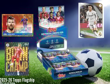
The Rainbow Trap: Why Topps UCC 2025-26 is Drowning in its Own Parallels
There was a time when pulling a "Gold" card meant something. It meant you had found the rarest version of a player in the entire set.
ARTICLES
@specialonecards
1/15/20263 min read
There was a time when pulling a "Gold" card meant something. It meant you had found the rarest version of a player in the entire set. You could look at your collection and know exactly where you stood. But looking at the newly released 2025-26 Topps UEFA Club Competitions checklist, I don’t feel like a collector anymore. I feel like I’m looking at a hardware store paint-swatch aisle.
Topps has officially hit the "more is better" wall, and they’ve hit it hard.
By the Numbers: The Death of Scarcity
If you think the "parallel fatigue" you’re feeling is just in your head, the math proves otherwise. Topps hasn't just increased the number of colors; they’ve created an explosion that makes "scarcity" a total illusion.
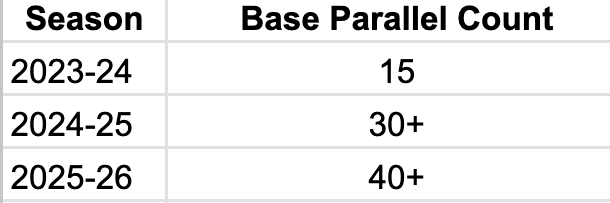
Look at the trajectory of the "Flagship" base set over the last three years:
.
We’ve reached a point where "scarcity" is a marketing term, not a physical reality. When you have Neon Yellow, Pink, Blue, Purple, and Green FlowFractors—and that’s before we even get to the numbered stuff—the "base" card starts to feel like trash. And when the base card is treated like trash, the soul of the hobby dies a little bit. We’re no longer collecting players; we’re collecting shades of highlighter ink.
The "Blaster" Confusion
The retail side is even worse. This year, Topps has flooded Value Blasters with Inferno and Holo parallels. They’ve added new tiers like Yellow Inferno Holos (/299) and Pink Holo Foil SPs. Why? Because they know that if they didn’t invent ten new names for "shiny card," nobody would buy a $25 box.
In 2005, a card numbered to /250 was a massive pull. In 2026, it’s just one of forty different versions of the same photo. It’s exhausting to track, and it’s even harder to explain to a casual fan why one purple card is worth $50 and another purple card is worth $5.
The Checklist Bloat
The current checklist features over 40 different parallel types for the base set alone. Forty. Think about that. If you want to "rainbow" your favorite player — say, a Lamine Yamal or an Estêvão Willian— you aren't just looking for five or six cards. You’re embarking on a multi-thousand-dollar quest to find forty different versions of a single image.
It’s a blatant cash grab designed to keep people ripping packs in search of a "one-of-one" that, visually, is only marginally different from the "one-of-five."
What Happened to the Art?
When a set is this focused on "FlowFractors" and "Raindrops," the actual photography takes a backseat. The 2025-26 design is supposed to be the "Flagship," but it feels like a background for a laser light show. I want to see the sweat on the jersey and the grass on the pitch, not a "Neon Green FlowFractor" pattern that makes the card look like the floor of a 90s bowling alley.
The Bottom Line
I love the UEFA competitions. I love the rookies. I even like the 8-Bit inserts and the Messi sketch cards—those feel like actual content. But the endless sea of parallels is a distraction.
Topps is giving us quantity and calling it quality. They’re giving us a rainbow and telling us there’s gold at the end of it, but when every pack has three "special" parallels, none of them feel special anymore. I’m skipping the rainbow this year. I’ll be over here looking for the cards that actually matter.